How Do I Design a Billboard That Actually Gets Noticed?
Billboards are everywhere, lining highways, popping up on city streets, and towering over busy intersections. But most of them fade into the background, barely noticed by the thousands of people who drive or walk by each day. If you are investing in a billboard, you don’t want to be just another part of the scenery. You want your message to stand out, make an impact, and be remembered.
So, how do you design a billboard that actually gets noticed? Here’s a comprehensive, step-by-step guide packed with practical advice and real-world examples.
1. Keep It Simple
Less is more. This rule is the golden standard for billboard design. Drivers and pedestrians have just a few seconds to glance at your billboard, usually about six seconds or less. If your message is too complicated, it won’t land.
- Use a Short, Clear Message: Aim for 6–8 words. Get straight to the point.
- Focus on One Idea: Don’t try to say everything at once. Pick your main goal, brand awareness, event promotion, a call-to-action and make it the focus.
- Example:
- Instead of “Come Visit Our Store for Great Deals on Shoes, Hats, and Accessories This Weekend!”
- Try: “50% Off Shoes—This Weekend Only!”
2. Choose Bold, Readable Fonts
Your billboard has to be legible from a distance and at high speed. Fancy or thin fonts may look good up close but get lost in real life.
- Go Big: Your font size should be huge. Test it by printing your design small and holding it at arm’s length.
- Sans Serif Is Your Friend: Simple fonts like Arial, Helvetica, or Impact are easy to read from afar.
- High Contrast: Make sure your text color pops against the background. Black on yellow, white on blue, or red on white are classic combinations.
3. Use Eye-Catching Colors
Bright, contrasting colors grab attention. Avoid using colors that blend together or fade into the sky or cityscape.
- Think Contrast: Pair light text with dark backgrounds, or vice versa.
- Limit Your Palette: Stick to 2–3 main colors. Too many colors can get distracting.
- Stay On-Brand: Use your company’s brand colors for consistency, but don’t sacrifice readability for style.
4. Make Images Work for You
A single, powerful image is often more memorable than any amount of text. Choose a photo, illustration, or logo that instantly communicates your message.
- Use High-Quality Images: Billboards are large. Low-res photos will look blurry and unprofessional.
- Avoid Clutter: One image is usually enough. Too many graphics can overwhelm your audience.
- Relevant Visuals: Make sure your image is tied directly to your message. A dentist’s billboard with a photo of a happy smile works; a random mountain landscape probably doesn’t.
5. Create a Strong Call to Action
If you want people to do something, make it clear and easy. The call to action (CTA) should be direct and simple.
Examples:
- “Call Now”
- “Visit Us Today”
- “Order Online”
- “Text DEAL to 12345”
- Contact Info: Use a website, phone number, or a simple social media handle. Avoid long URLs or anything hard to remember.
Pro Tip: Custom URLs or QR codes work well if you want to track billboard responses, but only if they are easy to type or scan.
6. Use Clever, Memorable Copy (But Don’t Overdo It)
A clever pun or a surprising statement can stick in people’s minds but clarity is always more important than cleverness. If your joke takes more than a second to get, skip it.
7. Think About Placement
Even the best design won’t work if people can’t see your billboard clearly.
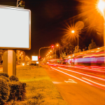
- Consider the Environment: Will your design stand out against the sky, trees, or buildings?
- Know Your Audience: Tailor your message to the people who are most likely to see the billboard in that location.
- Positioning: Make sure nothing (trees, poles, other signs) blocks your billboard from the road or sidewalk.
8. Test Your Design
Before going live, test your billboard in as real a way as possible.
- Shrink the Design: Print your billboard at a tiny scale and see if you can read it from across the room.
- Simulate Drive-By: View your design for 6 seconds, can you grasp the main point instantly?
- Ask for Feedback: Get honest opinions from people who weren’t involved in the design.
9. Be Unique, But Stay True to Your Brand
Bold, creative ideas get noticed. Unusual shapes, 3D elements, or humor can all help you stand out—but don’t lose your brand voice or core message.
Examples:
- A lawyer’s billboard with an oversized gavel popping out.
- A pizza shop with a 3D slice “falling” off the edge.
- Funny or heartwarming messages that make people smile.
10. Stay Consistent
If your business uses multiple billboards or other types of advertising, make sure your message, colors, and logos match everywhere. Consistency builds brand recognition and trust.
Final Thoughts: What Really Makes a Billboard Stand Out?
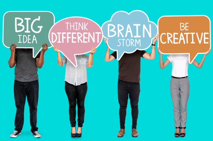
It comes down to three things: simplicity, clarity, and creativity. Remember, your audience is moving. They are not looking to read a novel, they are scanning for a message that pops.
Stick with bold fonts, high-contrast colors, a focused message, and a memorable image. Test your design and never forget your audience’s point of view. And above all, have fun with it, sometimes the most noticed billboards are the ones that break the rules in just the right way.
If you are ready to design a billboard that gets noticed and remembered, keep these rules in mind, and you’ll already be ahead of most of the competition.
Need help creating a winning billboard?
Contact us for design support, tips, or a quote on your next outdoor ad campaign. Your message deserves to be seen!


